Testimonial Carousel is the perfect way to show your clients the potentiality of your provided work. It increases the trust of a new visitor and makes your site trustworthy. A testimonial carousel is a slider containing testimonials of many clients. If you want to provide more than one testimonials in your site then you must go for testimonial carousel. It will save the space holding multiple testimonials in one box.
 To add this element in a section, follow these steps.
- Select Add New Element from column to open elements list modal
- From there select Testimonial Carousel element
A popup will appear showing three tabs - General, Styles ,& Advanced. These tabs will help you to modify the Testimonials in your way. You can add new fields, change the color and font, change button settings etc. The details are given below.
General Tab
The general tab holds the basic setting of testimonials. You’ll find the following editing options here.
- Fields Group - Fields group holds various testimonial fields.
A few fields are given in the fields group.
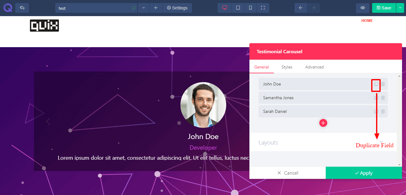 You can duplicate an existed field using this square icon.
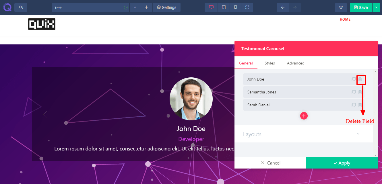 You can delete an unnecessary field by clicking this basket icon.
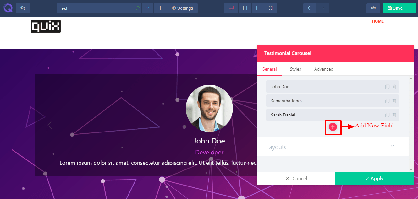 You can add a new field under existing field using this red + plus button.
You’ll find a few settings of each field inside the fields group. These settings are described below.
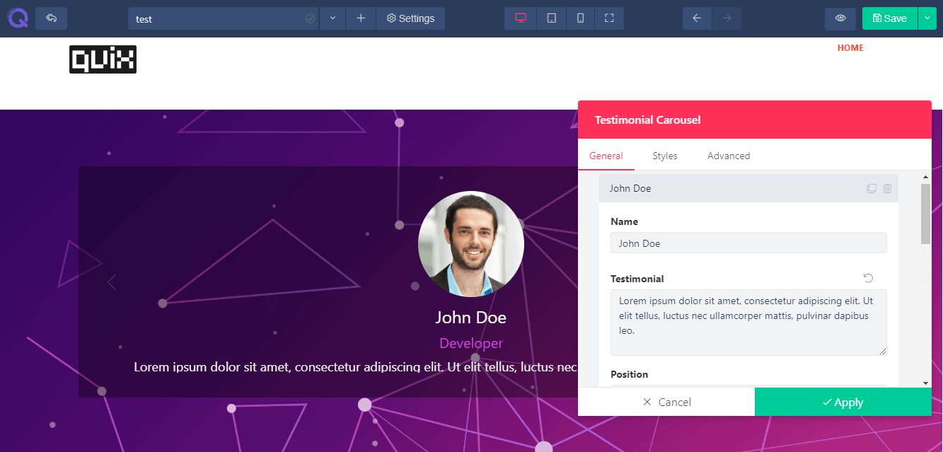
- Name - Title field will help you to add a new title in form. Without a title a user will not understand what to write in it.
- Testimonial - A type field will help you to set what type of answer you need to know of your user. Is it a text type, email type or html code type etc. The input field will response according to its provided type.
- Position - Placeholder field is a faded text provided in the input field for users knowledge. This field will help a user to know what type of information to be provided in that specific field.
- Image - Enabling required option will allow the user to provide a must information. Without filling the required option a user cannot submit the form.
- Alternate Text - You can set the width of the column using this field. If you need a short input you can provide a short width input field. In case of long input, you can provide a broad input field.
- Caption - Help text field will help your user to know more about the input field. You can set a note or warning for your user.
- Layout - In the layout field there is ‘center active item’ situated. If you enable this field, you will see other two testimonials peeping out both in left and right side.
Styles Tab
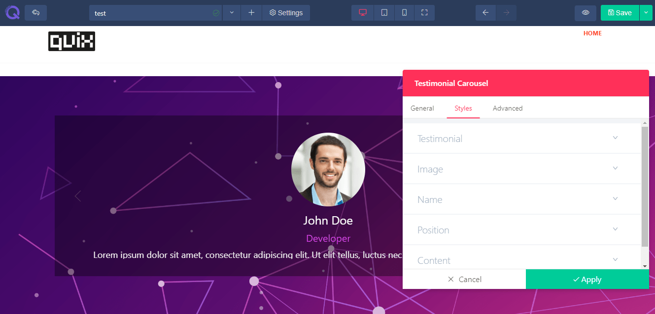 Styles tab will help you style up the element. Here you’ll find five editing fields : Testimonial, Image, Name, Position and Content. The editing options are provided according to each field.
- Content Alignment - Content alignment will help you to set the content in an alignment form. You can set the whole content in three styles - left, center and right.
- Image Width - You can control image width using scrolling or inserting a value in the input box situated right next to the scrolling bar. You can enlarge the image or make it small.
- Position - This field will help you to set the image in different positions. There are four positions available - left (set the image in the left side of other contents), right (set the image in the right side of other contents), up (set the image above the contents) and down (set the image under the contents).
- Spacing - There are a few slidebars available for spacing. You can add space between image and other fields, name and other fields, position and other fields.
- Border Radius - There is a border radius available in the image field. You can control the radius of image by it. If you want a round shaped image then set the value of border radius more than 50.
- Color - A few color picker is provided for different operations. You’ll find color setting options for text field, background of input box, setting a border color, button option etc.
- Font - Font option will help you to change the font of text. There are thousands of google font provided in a dropdown option. You can go for any of them. You can change the font of label and text field.
- Size - You can control the size of text and digits of both label and input field. Just scroll the slider and set the size. Or just provide a digit value for it in the value box situated right next to the slider.
- Line Height - Line height option will help you to set the height of each and every line. This will insert space between the lines.
- Letter Spacing -Letter spacing option will help you to set space between each and every letter. This will help you to avoid the collision between the letters.
- Text Shadow - Text shadow effect will help you to add a shadow under the text to give a 3D look. Or you can blur the effect to show your text clearly.
Advanced Tab
 The advanced tab has the advanced level of settings. You can edit them if you find it necessary or just leave it just the way it is. Here you’ll find six fields : Element styles, Background, Border & Box Shadow, Animation, Custom CSS, and Identifier. These fields are described below in details.
- Element style - Here you’ll find the margin, padding and z-index option. Margin will help you to add space in accordance with page. Padding will help you to add space in accordance with the column. Z-index will work if you have 2 elements overlapping and you want to display the below element on top. Increment the z-index value and the below element will appear on top.
- Background - Background field will allow you to set a background in the column. You can set an image, a solid color or gradient effect of multiple colors.
- Border & Box Shadow - You can give a nice designed border and box shadow to your column. Set a border type, border radius if you want a bit of round shape in the corner. And box shadow effect will give your column a floating effect. You can set color to it, spread the color or add blur it.
- Animation - Animation field will allow you to add a transition effect to the element. Select the entrance animation from the given effects, set the delay time and enable the repeat option (this is optional).
- Custom CSS - This field is available only on PRO version If you are a developer then you can add CSS code of your own to the site by using this operation. Just write the code and click the apply button. You’re CSS code will be added to the content and it won't affect the existing css effect..
- Identifier - This field holds the CSS id of every specific content. This will help you to edit the CSS section if you want to bring any changes in css style.